Blue food packaging design and when it works on shelf
What blue communicates in food packaging
Blue food packaging is seldom a decoration-only choice. For shoppers, blue often suggests cleanliness, freshness, coolness, trust and control. That makes it useful for categories such as water, dairy, seafood, frozen food, saltier snacks, sugar-free drinks and products that need a calm, technical or hygienic tone. The same color can work against a product when the main selling point is warmth, indulgence, ripeness or sweetness. A good blue packaging decision therefore starts with the food’s sensory promise, not with a color trend.
Color is one of the fastest signals on a shelf or product listing. Before shoppers read the ingredients, claims or storage instructions, they see the visual system. In food packaging, that system has to do several jobs at once: attract attention, set taste expectations, support the brand, protect legibility and avoid misleading consumers. Blue can do this well, but only when it supports the product instead of competing with it. You can also explore more in Food Packaging.
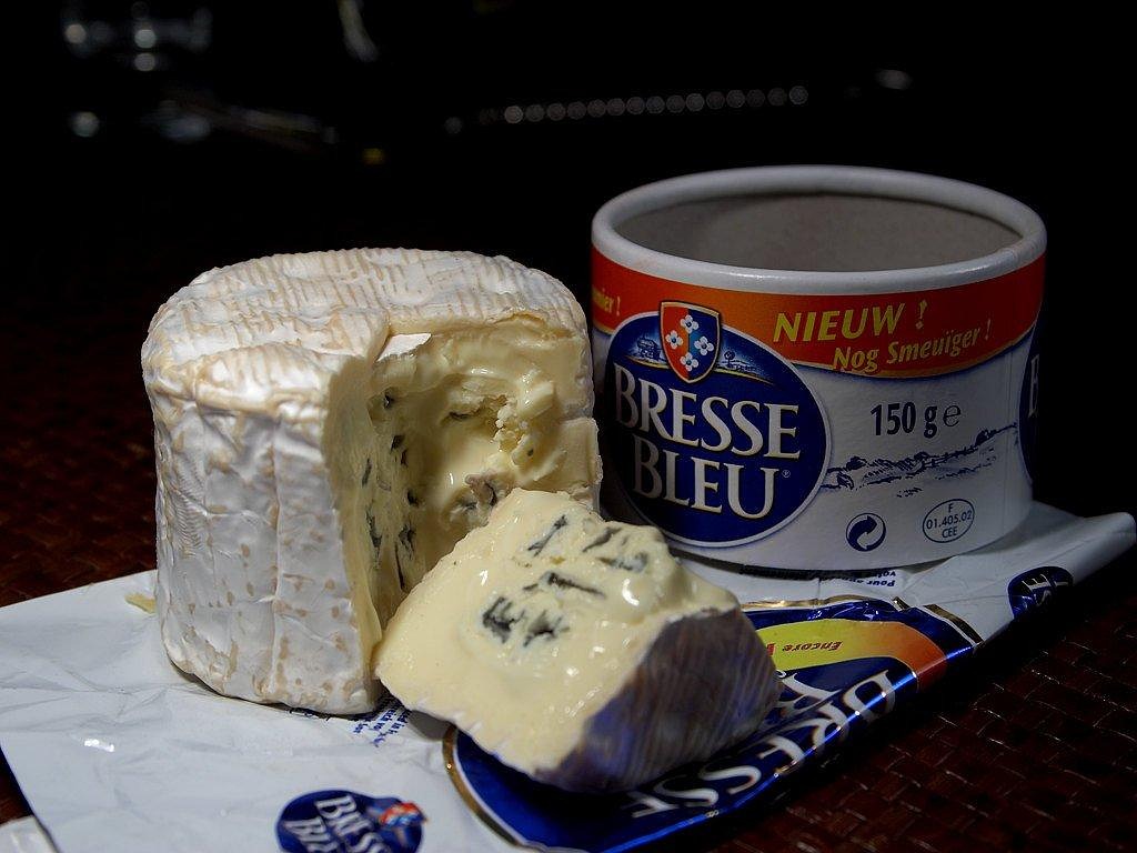
For more packaging design and material topics, visit the Food Packaging section.
Where blue packaging works best
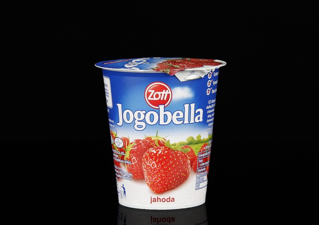
Blue is most effective when the product story naturally connects with freshness, coldness, purity or controlled quality. This is why blue is common in bottled water, ice cream, frozen seafood, yogurt, milk, chilled desserts, oral-care-adjacent nutrition products and some functional beverages. It can make a pack feel crisp and orderly, especially when used with white, silver, clear film or high-contrast typography.
For refrigerated and frozen foods, blue can reinforce the cold-chain message. A pale blue background may suggest chill and cleanliness, while deeper navy can create a premium or technical feel. In seafood packaging, blue can echo water and marine freshness. In dairy, blue is often used to differentiate fat levels, flavor ranges or product families, although conventions vary by market and brand.
Blue can also help when a food product needs to reduce visual heaviness. A dark chocolate pack, protein bar or snack with dense nutritional claims may use blue accents to make the design feel more balanced and less overtly sweet. For functional foods, blue can support a sense of precision, especially when paired with simple icons, clear serving information and restrained claims.
| Food category | Why blue may work | Design caution |
|---|---|---|
| Water and beverages | Signals purity, coolness and refreshment | Avoid making flavored drinks look medicinal unless that is intended |
| Frozen food | Reinforces cold storage and freshness | Use warm food photography to prevent the meal from feeling flat |
| Seafood | Connects naturally with marine cues | Do not rely on blue alone to imply freshness; date and handling information still matter |
| Dairy | Can suggest cleanliness and product differentiation | Check local category conventions because color codes differ |
| Salty snacks | May fit savory or sea-salt positioning | Blue may be less effective for sweet or caramelized flavor cues |
Where blue can weaken appetite appeal
Blue is less common in natural foods than red, yellow, green, brown or orange. Because many ripe, sweet and cooked foods are associated with warmer colors, heavy blue packaging can make a product feel colder, less aromatic or less indulgent. This is not an absolute rule, but it is a practical risk for bakery, confectionery, sauces, ready meals and fruit-led products.
A 2022 study in Color Research & Application examined popcorn packaging colors and found that packaging color influenced taste expectations. In that study, yellow and red were more suitable for sweet popcorn, blue was more suitable for salty popcorn, and white was more suitable for tasteless popcorn. The research does not mean blue always belongs to salty food, but it does show why designers should test color against the intended taste cue.
Blue can also create a mismatch when the product image carries warm sensory signals. A golden pastry on a cold blue background may look less fresh if the contrast is not handled carefully. A tomato sauce pack with dominant blue may need strong food photography, red accents or a clear flavor descriptor to avoid confusing shoppers.
The safer approach is to separate brand color from taste color. A brand may use blue as its main identity, while secondary colors, photography and texture communicate flavor. This keeps the brand system consistent without making every product in the range feel the same.
Food safety and compliance come before color
In food packaging, blue ink, coating, label stock and printed film are not only graphic choices. They are part of a food contact system that must be suitable for the product, package structure, filling process, storage conditions and target market. The U.S. Food and Drug Administration explains that food contact substances that are food additives must be authorized for their intended use before marketing in the United States. FDA review considers migration data and toxicological information to evaluate whether consumer exposure from the intended use is safe.
In the European Union, Regulation (EC) No. 1935/2004 sets general requirements for food contact materials. It requires materials and articles to be manufactured under good manufacturing practice so that, under normal or foreseeable use, they do not transfer constituents to food in quantities that endanger health, cause unacceptable changes in food composition, or deteriorate organoleptic characteristics such as taste and odor. The European Commission also summarizes this framework as requiring food contact materials not to release harmful levels of constituents or change food composition, taste and odor in an unacceptable way.
For printed food packaging, ink placement matters. A blue design printed on the outside of a pouch is different from a colorant used in a layer with direct food contact. Guidance from the European Printing Ink Association notes that printing inks for food contact materials may involve both direct and non-direct food contact applications, and that migration, set-off and gas-phase transfer are part of the safety discussion. In practical terms, converters and brand owners should not assume that an attractive blue ink is suitable just because it looks stable on the press.
Design teams should also consider legibility and mandatory information. Nutrition facts, allergen statements, date marks, storage instructions and recycling guidance need sufficient contrast. A stylish navy background can create problems if small black type, low-contrast silver text or glossy varnish makes required information difficult to read under store lighting.
Sustainable blue design without confusing the material message
Sustainability has become part of packaging evaluation, but it should not be treated as a color shortcut. A blue pack can look clean and responsible, yet the actual environmental profile depends on material choice, recyclability, recycled content, inks, coatings, labels, adhesives, package weight, product protection and local collection systems.
McKinsey’s March 2025 U.S. consumer packaging survey reported that price, quality and convenience remained more important purchase criteria than environmental impact for many consumers, while food safety and shelf life were leading packaging concerns. This matters for blue food packaging because visual freshness is not enough. The package still has to protect the food, communicate value and make proper use clear. See also: Eco Packaging.
Blue can also affect recycling communication. Dark colors may interfere with some sorting or visual recognition systems, depending on the material and local infrastructure. Full-sleeve labels, metallic inks, heavy coatings and mixed-material decorations can make an otherwise recyclable container more difficult to process. The issue is not simply whether the pack is blue, but how the color is applied and whether it compromises detection, separation, washing or reprocessing.
For paper-based packs, blue ink coverage may influence the visual cleanliness of recycled fibers, depending on ink type and deinking performance. For plastic packs, designers should coordinate color, label and adhesive decisions with the material specification. If sustainability is a central message, the claim should be specific and verifiable, such as recyclable where facilities exist, made with a stated percentage of recycled content, or designed for mono-material construction. Vague environmental language can weaken trust.
A practical checklist for blue food packaging
Blue can be a strong packaging asset when it is treated as part of a complete packaging system. Before approving a blue design, brand owners and packaging teams should review the following questions.
- Does the color match the eating occasion? Blue fits cold, fresh, clean, marine, functional and salty cues better than warm, baked, ripe or caramelized cues.
- Does the pack still create appetite? If blue is dominant, use photography, texture, contrast or accent colors to keep the food visually appealing.
- Is the color role clear? Decide whether blue is the brand color, flavor code, freshness cue, health cue or premium signal. It should not try to do everything at once.
- Are inks and coatings suitable for the structure? Confirm food contact status, migration risk, set-off controls and supplier documentation for the intended market.
- Can shoppers read the required information? Test nutrition, allergen, storage and date information under realistic lighting and at real pack size.
- Does the design support the material story? Check whether pigments, labels, sleeves, varnishes or mixed materials affect recyclability or disposal instructions.
- Has the design been tested with real alternatives? Compare blue against warmer, greener or neutral designs to see whether it improves recognition, trust and taste expectation.
For a small brand, the most useful test may be simple: show two or three pack options to target shoppers without explaining the design intent. Ask what flavor, freshness, quality level and usage occasion they expect. If the answers do not match the product, the blue system needs adjustment.
Design implications for packaging teams
The main lesson is that blue packaging should not be copied from another category without context. A blue bottle label for water may feel natural; the same shade on a hot sauce pouch may feel disconnected. A navy frozen seafood carton may feel premium; the same navy on a children’s sweet snack may suppress the playful taste signal.
Packaging teams should treat blue as a controlled design variable. Hue, saturation, brightness, finish and coverage all change the message. Pale blue can feel light and clean. Cyan can feel energetic and modern. Deep navy can feel premium or corporate. Metallic blue can feel cold or technical. Matte blue can feel softer and more natural than glossy blue. These differences matter as much as the word “blue” itself.
The best blue food packaging balances three needs: it attracts attention, sets the right sensory expectation, and remains safe and compliant for the product’s intended use. When those needs align, blue can be more than a background color. It can become a clear signal of freshness, trust and product identity.
Frequently asked questions
Is blue a good color for food packaging?
Yes, when the product benefits from cues such as freshness, cleanliness, coldness, purity or trust. It is especially useful for water, dairy, seafood, frozen foods, functional beverages and some salty snacks. It may be less suitable as the dominant color for foods that rely on warmth, sweetness or baked appeal.
Why is blue less common for some foods?
Many appetite cues in food are linked to warm and natural colors such as red, yellow, orange, brown and green. Because blue is less associated with ripe or cooked foods, it can sometimes reduce perceived warmth or sweetness if used without supporting photography or accent colors.
Does blue packaging affect taste expectations?
Research indicates that packaging color can influence taste expectations. A 2022 popcorn packaging study found that blue was more suitable for salty popcorn than for sweet popcorn in that specific test. Results can vary by product, market and brand, so testing remains important.
Are blue inks safe for food packaging?
Safety depends on the ink, substrate, package structure and intended use. Food contact materials must meet applicable requirements for the target market, and teams should verify migration risk, set-off controls and supplier documentation before production.
Can blue packaging be sustainable?
It can be, but sustainability depends on the full packaging system rather than the color alone. Material selection, recyclability, recycled content, ink coverage, labels, coatings and local recovery infrastructure all matter.