How Does Chocolate Packaging Colour Influence Consumer Perception in Premium Markets
How Does Colour Affect Consumers’ Perception of Packaging?
Colour plays a decisive role in how consumers perceive packaging, especially in premium categories like chocolate. It is not merely aesthetic; it shapes emotional engagement, product expectations, and brand loyalty. Research in consumer psychology shows that specific hues can evoke trust, indulgence, or exclusivity. For chocolate packaging, darker palettes tend to signal richness and sophistication, while lighter tones suggest sweetness or approachability. The interplay between colour harmony, texture, and cultural symbolism defines how luxury brands communicate value. In essence, colour is a silent language that influences perception before a single word on the box is read.
The Psychological Foundations of Colour Perception in Premium Chocolate Packaging
Colour perception in premium chocolate packaging operates at both cognitive and emotional levels. It informs how consumers interpret quality cues and connect with brand narratives through subconscious associations.
The Role of Colour in Cognitive and Emotional Processing
Colours trigger immediate emotional responses that influence purchase decisions. Warm tones such as gold or bronze often evoke comfort and indulgence, while cool shades like blue or silver convey calmness and refinement. These reactions are rooted in cognitive processing where the brain links colour stimuli to past experiences of taste and pleasure. In retail environments, this connection can mean the difference between impulse buying and brand recall.
Warm hues tend to enhance appetite appeal—a reason many confectionery brands rely on rich browns or deep reds to suggest intensity. Cool tones, when used sparingly, balance the visual weight by adding freshness or modernity. Cultural context further shapes these responses; for instance, red may symbolize passion in Western markets but luck in East Asian cultures.
Symbolism and Semiotics in Luxury Packaging Design
Luxury chocolate packaging relies heavily on semiotic cues where every colour choice carries symbolic weight. Metallics such as gold and copper communicate opulence and craftsmanship. Deep hues—navy, burgundy, charcoal—signal maturity and exclusivity. Matte finishes soften reflections to create tactile intimacy associated with artisanal quality.
Typography interacts with these colours to reinforce identity: serif fonts paired with muted backgrounds evoke heritage brands, while sans-serif lettering on glossy surfaces projects modern minimalism. Subtle contrasts between background and accent tones help establish hierarchy—guiding the eye from logo to product name—while maintaining an air of restraint critical for premium positioning.
Colour as a Signal of Quality and Value in Premium Markets
In high-end chocolate markets, colour serves as an implicit indicator of product quality long before tasting occurs. Its interpretation depends on tone depth, saturation balance, and harmony across design elements.
Consumer Interpretation of Dark vs. Light Tones in Chocolate Packaging
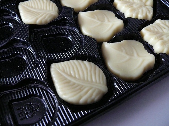
Dark tones dominate premium chocolate packaging because they communicate richness and intensity linked to cocoa purity. Shades like espresso brown or black are often perceived as markers of artisanal craftsmanship or high cocoa content. Conversely, lighter tones—creams, pastels—suggest sweetness or accessibility suited for milk chocolates or limited-edition collections targeting younger audiences.
The saturation level also matters: overly vivid colours may cheapen perceived quality by resembling mass-market confectionery. Balanced contrast between text and background ensures clarity while preserving elegance—a subtle yet powerful cue that influences price perception.
The Influence of Colour Harmony on Premium Brand Perception
A harmonious palette conveys balance and trustworthiness essential for luxury branding. When hues complement each other naturally—like dark brown paired with muted gold—the result feels cohesive and timeless. Disruptive combinations risk undermining sophistication by appearing inconsistent or overly experimental.
Consistent chromatic identity across product lines builds recognition over time. Brands such as those using recurring tonal motifs strengthen equity by training consumers to associate specific palettes with authenticity and reliability.
Cross-Cultural Variations in Colour Perception for Chocolate Brands
Global expansion requires sensitivity to cultural symbolism embedded within colour choices. What signals prestige in one market may carry spiritual or emotional connotations elsewhere.
Cultural Symbolism of Colours in Global Premium Markets
Gold remains a universal emblem of prestige across Western markets but may represent spirituality or divine purity in South Asia. Red embodies passion in Europe yet signifies prosperity in China—a nuance that influences holiday edition designs for chocolate packaging worldwide.
Understanding these symbolic variations allows global brands to maintain coherence while resonating locally. A misaligned palette could unintentionally distort brand meaning or alienate target demographics sensitive to cultural codes.
Adapting Packaging Strategies for Regional Preferences
Regional adaptation does not mean abandoning core identity; rather it involves recalibrating tone intensity or accent use to align with local expectations. For instance, a European dark-chocolate line might feature subdued metallics, whereas its Japanese counterpart could incorporate minimal white space with soft gold detailing reflecting aesthetic restraint valued there.
Market testing through focus groups helps verify whether design intent matches consumer interpretation before full-scale rollout—critical when operating across culturally diverse markets where perception thresholds differ subtly but significantly.
The Interaction Between Colour and Other Sensory Cues in Packaging Design
Colour rarely acts alone; it interacts dynamically with texture, finish, and material composition to shape multisensory impressions that define luxury experiences.
Integrating Texture, Finish, and Material with Colour Strategy
Matte finishes combined with muted tones convey quiet confidence often associated with boutique craftsmanship. Glossy textures paired with vibrant colours suggest innovation or youthful energy suitable for contemporary sub-brands within larger portfolios.
Material choice further amplifies message delivery: recycled paperboard tinted in deep earth tones reinforces sustainability narratives without sacrificing elegance; metallic foils add tactile contrast enhancing shelf visibility under ambient lighting conditions common in retail displays.
Visual Hierarchy: How Colour Guides Attention on Packaging Elements
Colour placement dictates visual flow across packaging surfaces. Accent hues—perhaps a ribbon of copper outlining the logo—direct attention effectively without cluttering design space. Contrast levels determine readability; too little contrast blurs legibility while excessive variation disrupts harmony.
Designers often employ neutral backgrounds allowing focal colours like crimson seals or emerald emblems to stand out precisely where consumer gaze lands first—a principle validated through neuromarketing eye-tracking studies showing predictable scan paths influenced by chromatic emphasis zones.
Neuromarketing Insights into Colour-Based Consumer Decision Making
Advances in neuroscience have deepened comprehension of how colour triggers neural responses tied to luxury perception within premium categories like chocolate packaging.
Measuring Emotional Responses to Packaging Colours through Neuroscience Tools
Eye-tracking technology reveals attention patterns shaped by hue arrangement: consumers dwell longer on warm-coloured focal areas suggesting heightened engagement potential. EEG readings identify brainwave activity correlating with pleasure anticipation when exposed to balanced palettes typical of high-end brands.
Functional MRI studies further demonstrate activation within reward centers when participants view gold-accented designs compared with plain monochromes—evidence that certain pigments elicit subconscious associations linked directly to perceived indulgence value rather than functional attributes alone.
Predictive Modelling of Purchase Intent Based on Colour Preferences
Data analytics increasingly quantify relationships between hue selection and conversion metrics across digital campaigns tied to physical packaging launches. Machine learning models trained on behavioural datasets can predict which palette combinations yield higher engagement among demographic clusters segmented by age or income bracket.
These predictive insights inform iterative design cycles allowing brands to refine colour strategies empirically instead of relying solely on creative intuition—a shift toward evidence-based aesthetics now standard practice among top-tier confectionery producers competing globally for attention share within crowded retail shelves.
Strategic Implications for Premium Chocolate Brands
For premium chocolate manufacturers navigating saturated markets, strategic use of colour becomes central to differentiation while maintaining authenticity aligned with brand ethos.
Designing Colour Strategies Aligned with Brand Positioning Goals
Palette selection should mirror narrative intent: heritage brands may favor timeless neutrals underscored by metallic trims symbolizing legacy craftsmanship; innovative entrants might adopt unexpected pairings like slate blue against bronze lettering projecting modern artistry. Iterative testing across touchpoints—from box wraps to digital ads—ensures coherence reinforcing overall storytelling consistency vital for long-term recognition cycles.
Leveraging Sustainable Materials Without Compromising Colour Integrity
Sustainability introduces new technical challenges since eco-friendly substrates alter pigment absorption affecting final appearance under varied lighting conditions. Designers compensate through adjusted ink densities or layered coatings preserving vibrancy without resorting to synthetic laminates conflicting with environmental commitments.
Transparent communication about sustainable sourcing fosters trust among ethically minded consumers who equate ecological responsibility with genuine premium value—a growing trend reshaping future standards within luxury confectionery sectors worldwide.
FAQ
Q1: Why do luxury chocolate brands prefer darker packaging?
A: Darker shades project depth and exclusivity associated with artisanal quality; they align visually with the sensory richness expected from high-cocoa products.
Q2: How does colour harmony affect consumer trust?
A: Harmonious palettes create visual balance that subconsciously signals reliability; discordant colours can make even expensive items appear less credible or refined.
Q3: Can cultural differences change how people perceive the same colour?
A: Yes, cultural context alters interpretation—for example, red implies passion in Europe but luck in China—affecting how brands tailor regional editions of their packaging designs.
Q4: What role does texture play alongside colour?
A: Texture amplifies colour meaning; matte surfaces soften bold hues suggesting sophistication while glossy finishes intensify brightness implying innovation or energy appeal.
Q5: Are sustainable materials limiting design flexibility?
A: Not necessarily; though natural substrates modify pigment behavior slightly, careful calibration maintains desired tone accuracy while supporting eco-conscious branding goals.